
Creative, UI/UX, Website
Tatras
- Client
- Tatras
- Industry
- Luxury Outerwear
- Services
- Creative DirectionUI/UX DesignWeb Development
- Live Page
- Open Project
Case Study
Technical craft, framed like film.
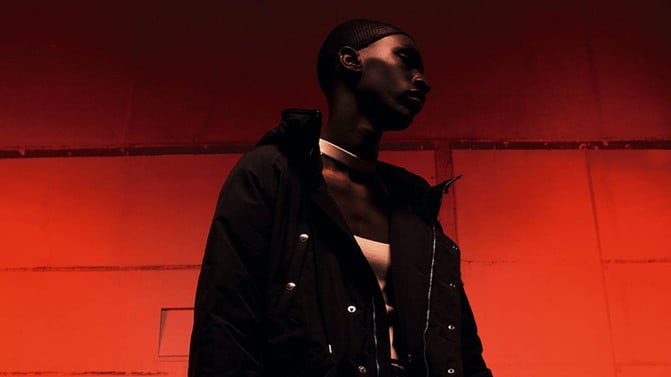
Tatras makes outerwear engineered like equipment and finished like couture — down jackets built for weather, cut for the city. The work set out to make a website feel as precise and deliberate as the garments it presents.
01
The Challenge
Technical luxury is a difficult thing to photograph and a harder thing to lay out. Tatras is known for outerwear engineered like equipment — the kind of quality you feel more than you see in a thumbnail — so a storefront has to convey precision and craft through restraint alone, not decoration.
The brand's visual language is cool, cinematic and spare: full-bleed photography, a lot of quiet, type that stays out of the way. The challenge was to build a digital home that felt exactly that considered — where nothing on the page undercut the idea that these garments are made properly.
02
The Approach
The direction leaned into discipline. Cinematic, full-bleed imagery, a cool and restrained palette, and confident-but-quiet typography let the photography carry the brand — while structure, not ornament, did the work of feeling premium.
Three commitments guided it:
Restraint as luxury
Space, silence and a cool palette. Let the garments and the photography speak, and keep everything else out of their way.
Cinematic, not busy
Full-bleed imagery that treats each season like a film still — a lookbook that happens to sell.
Editorial rhythm
A deliberate top-to-bottom pace, section by section, so browsing feels curated rather than crowded.
03
The Solution
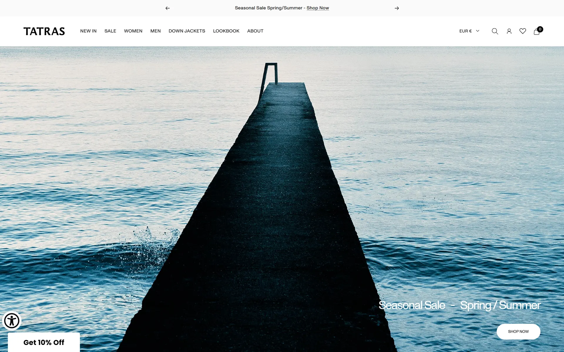
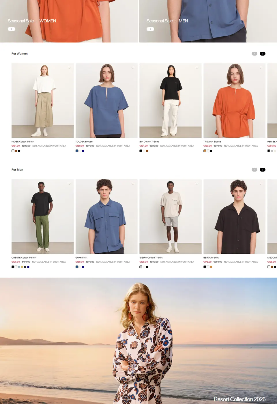
The storefront opens like a title sequence — a single, cinematic image and one line of type — then moves through the seasonal edits and the Down Jackets the house is known for, all held in the same cool, spare frame. It reads as engineered: exact, unhurried, quietly expensive.
The same discipline survives the shrink to a phone, where the imagery leads full-bleed and the navigation stays out of the way until it's needed.

04
The Impact
The work gives Tatras a digital home as considered as its outerwear.
-
A brand world, not just a shop. Cinematic imagery and a disciplined palette make the storefront feel like an extension of the product's craft.
-
Product-first at every size. The system keeps photography in the lead on desktop and mobile, so the garments always do the selling.
-
Premium by restraint. Feeling expensive here comes from what's left out — space, silence and structure — not from decoration.
Collaboration
Got a project?
Let's talk.
We're a team of creatives who are excited about unique ideas and help companies to create amazing identity by crafting top-notch UI/UX.