
Branding, Digital, UI/UX, WebsiteMarch 14, 2025
Yamaha Music School
- Client
- Yamaha Music School
- Industry
- Music Education
- Services
- UI/UX DesignWeb DevelopmentDeployment & HandoverSEO Consulting
- Live Page
- Open Project
Case Study
Playful enough for children. Polished enough for Yamaha.
Yamaha Music School asked for a children's course page that could be fun and professional in the same breath. We explored seven full iterations, shipped the one that performed best across conversion, design and performance — and the result was later adapted across Yamaha's markets in Asia.
01
The Challenge
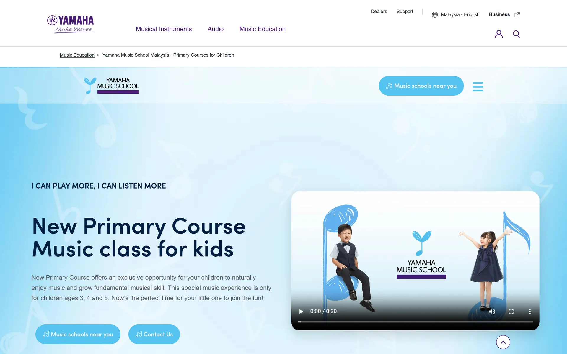
Yamaha Music School needed a new home for its flagship children’s programme — the New Primary Course — on my.yamaha.com. The audience is double-layered: the page had to charm the children the courses are for, while persuading the parents who actually read it, compare options and book.
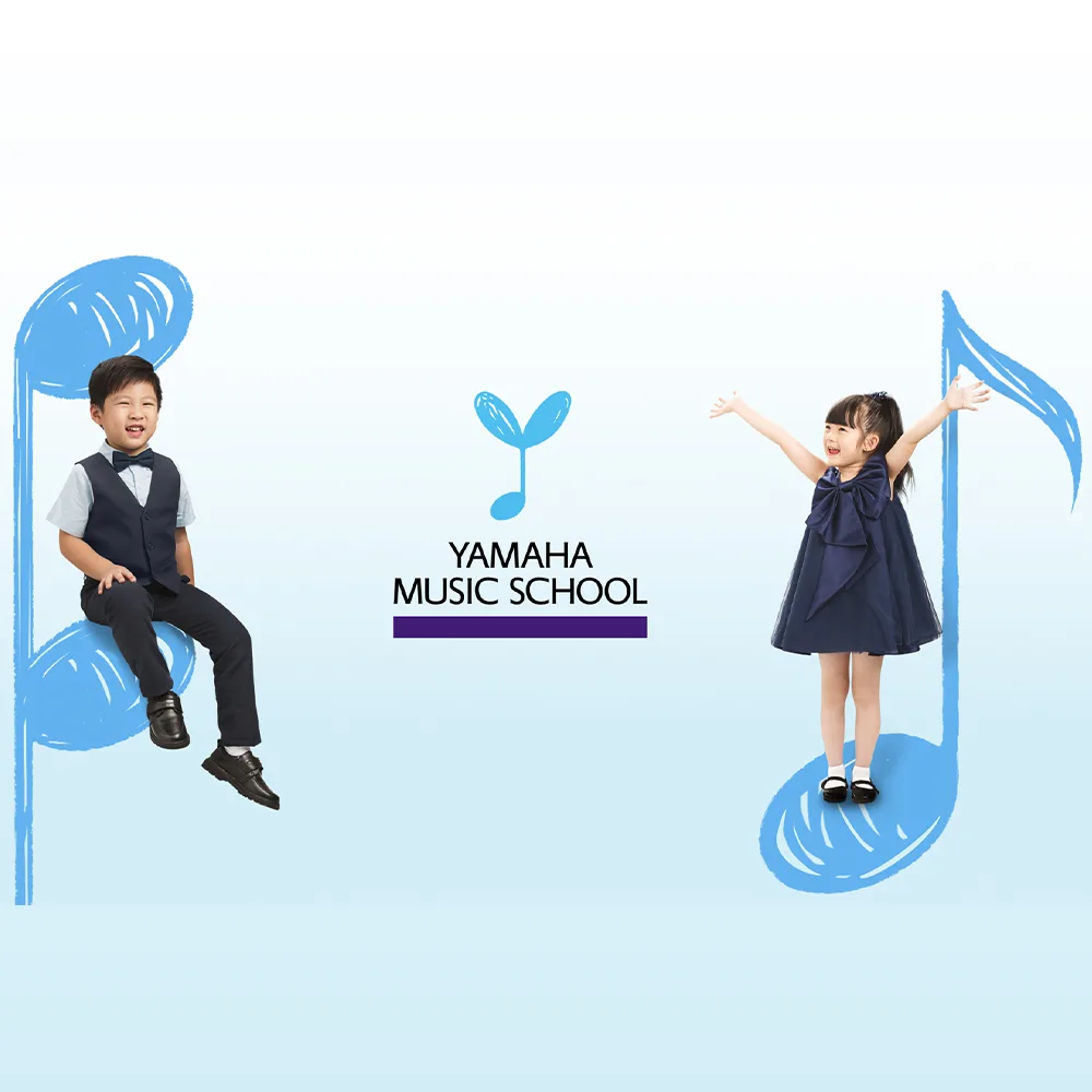
Yamaha’s brief captured the tension in one line: the page had to look fun and professional at the same time. It had to be built from the Yamaha Music School children’s palette — the sky blues and hand-drawn musical notes of the programme’s identity — without ever drifting into something that felt out of place on a global brand’s platform.
And beneath the look, this was a conversion page. Every design decision would ultimately be judged by whether more parents found a school near them and enquired.
02
The Approach
A brief like this doesn’t get settled by taste alone. We designed seven distinct iterations of the page — each one a different answer to the same question: how playful can this get before it stops feeling like Yamaha, and how disciplined before it stops feeling like childhood?
- Iteration 01
- Iteration 02
- Iteration 03
- Iteration 04
- Iteration 05
- Iteration 06
- Iteration 07
Every iteration was weighed through the same three lenses, and the direction that performed best across all three is the one that shipped:
Conversion
Does the page move parents toward the two actions that matter — finding a school nearby and enquiring about the course?
Design
Does it feel like the classes themselves — warm, musical, child-first — while staying unmistakably Yamaha?
Performance
Does it stay fast and light, so the experience holds up for parents on any device and connection?
The winning direction carries the children’s identity confidently: the programme’s sky-blue palette, hand-drawn musical notes, photography of children learning and performing, and one clear path through the page that always ends at “find a music school near you.”
03
The Solution
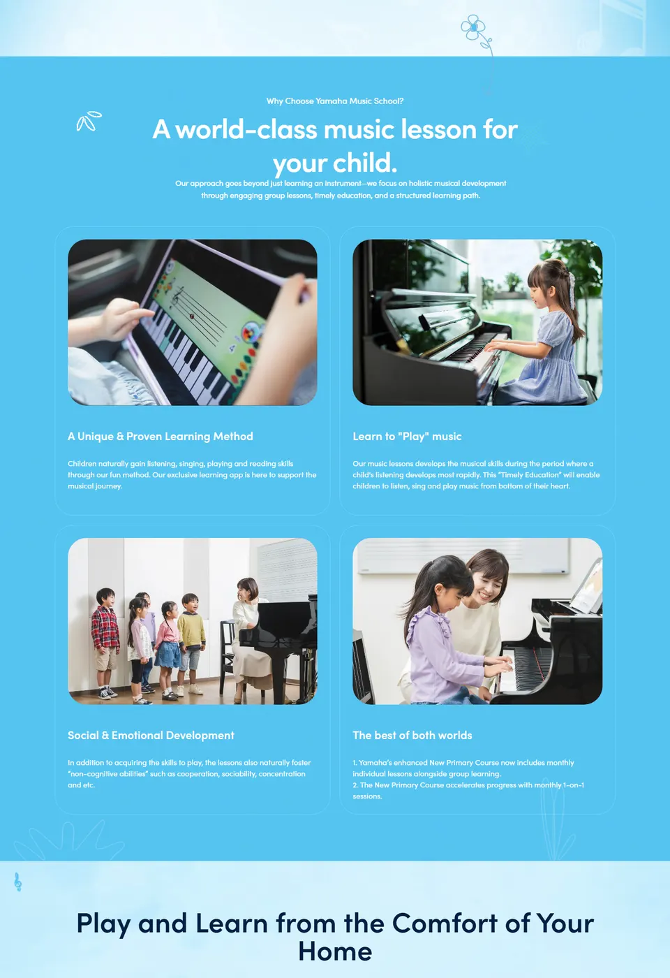
The shipped page walks a parent through the whole decision in one scroll: what makes the Yamaha method different, how children play and learn from home, what parents and students say, how musical skills develop over time, and which course fits which age — with “Music schools near you” one tap away the entire time.
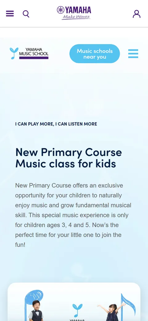
The same system scales down to a phone without losing its personality. Layout, type and imagery were designed mobile-first, for parents browsing in the minutes between everything else parents do.
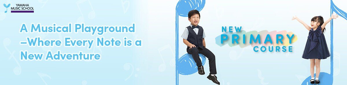
We also designed the campaign banner for the course — “A Musical Playground — Where Every Note is a New Adventure” — extending the page’s visual language into Yamaha’s own promotion of the programme.
And the work didn’t stop at Malaysia: the design was later adapted for Yamaha’s children’s course pages across other Asian countries.
04
The Impact
The clearest outcome is the one above: the page is live as the home of the New Primary Course, and it earned that place by performing best of seven candidates — not by being the only option on the table.
-
A conversion-first process. The shipped design was selected on evidence across conversion, design and performance, so every section on the page is there because it earned its place.
-
Built to travel. The design was adapted across Yamaha’s other Asian markets — the strongest signal a design system works is that it outgrows its first country.
-
SEO the team owns. Alongside deployment support, we consulted and educated Yamaha’s team on SEO — structure, metadata and heading hierarchy — so the page stays discoverable and can keep growing without us.
Collaboration
Got a project?
Let's talk.
We're a team of creatives who are excited about unique ideas and help companies to create amazing identity by crafting top-notch UI/UX.