
Identity, Marketing, UI/UX, Website
Sezane
- Client
- Sézane
- Industry
- Parisian Ready-to-Wear
- Services
- Brand IdentityMarketingUI/UX DesignWeb Development
- Live Page
- Open Project
Case Study
A Parisian wardrobe, translated to the screen.
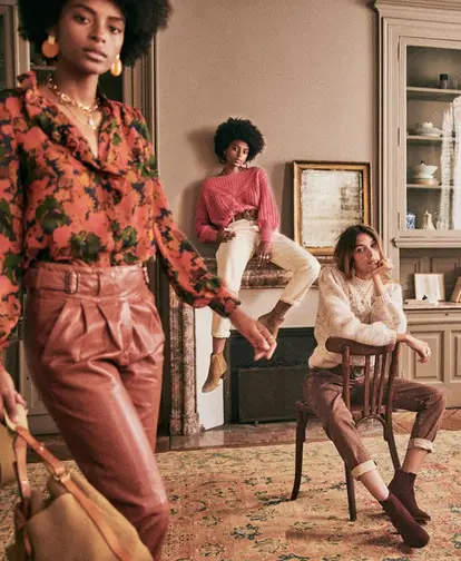
Sézane made its name selling the feeling of a Parisian boutique entirely online — considered, warm, quietly self-assured. The work centres on a single question: how do you keep that intimacy when the shop floor is a screen shared by thousands at once?
01
The Challenge
A house that grew up online has no flagship to hide behind — the website is the boutique. Sézane's identity lives in soft, unhurried photography, a restrained palette and a tone that reads more like a letter from a friend than a catalogue. Every one of those qualities is easy to lose the moment a brand starts to scale: the grid gets busier, the type gets louder, the warmth gets optimised away.
Founded in 2013 by Morgane Sézalory, the brand had already built a devoted following on exactly that softness. The task was to protect it — to design a storefront that could carry constant newness and hundreds of products while still reading, unmistakably, as Sézane.
02
The Approach
We started where the brand's feeling actually comes from: photography, pace and restraint. Rather than design pages one by one, we defined a system — the way type, spacing, colour and imagery behave together — so that every collection, product and story inherits the same quiet confidence without being hand-built.
Three principles held the work together:
Editorial first
Treat imagery as the primary voice. Layout exists to frame the photography and give it room to breathe — never to compete with it.
A system, not pages
Type, grid, colour and components defined once, so newness can ship quickly and still feel considered.
Quietly fast
Performance as part of the aesthetic — a storefront that feels as effortless as it looks, on any device.
03
The Solution
The result is a storefront that behaves like the brand: generous imagery, a disciplined palette and an unhurried rhythm that lets a visitor browse for pleasure long before they think about shopping. Collections read as stories; products sit in clean, confident frames; and the whole experience scales down to a phone without trading away its poise.
On a phone — where most of this browsing actually happens — the same restraint holds: one considered column, imagery leading, the wardrobe always a tap away.
04
The Impact
The clearest measure of the work is consistency: a storefront where every new arrival looks like it belongs, because the system decided how it should look before it existed.
-
A brand that scales. A design system lets Sézane keep adding collections and campaigns without the storefront drifting from its own identity.
-
Considered on every screen. The same editorial calm reads on desktop and mobile — no stripped-back compromise for smaller devices.
-
Built to browse. Speed and restraint keep the experience feeling effortless, so shopping happens without friction getting in the way.

Collaboration
Got a project?
Let's talk.
We're a team of creatives who are excited about unique ideas and help companies to create amazing identity by crafting top-notch UI/UX.