
Filling Pieces
- Client
- Filling Pieces
- Industry
- Footwear & Fashion
- Services
- E-commerce UI/UXShopify BuildEditorial DesignMobile-first Front-end
- Live Page
- Open Project
Case Study
Where streetwear meets the shop window.
Filling Pieces built its name in Amsterdam bridging streetwear and high fashion. The brief was an e-commerce experience with the same confidence as the product — editorial, image-led and fast — rebuilt on Shopify and designed mobile-first.

01
The Challenge
Filling Pieces is a premium footwear and fashion label with a distinct identity — streetwear attitude cut with high-end sensibility, rooted in Amsterdam and worn worldwide. A brand built on that tension needs a store that carries the same boldness and refinement its products do.
Fashion e-commerce lives or dies on two things: imagery and pace. The experience had to feel like a lookbook and behave like a fast, dependable shop — on a phone first of all, where most of the audience actually browses and buys.
02
The Approach
We redesigned the Shopify storefront around the brand's own imagery. The layout leans editorial — large-format visuals, generous white space, and typography with enough presence to hold its own next to the photography — so seasonal drops and collaborations read as campaigns, not catalogue rows.
Everything was designed mobile-first and built for speed, because a heavy, beautiful page that stalls on a phone loses the sale. Structure and storytelling were balanced against performance so the store feels immersive without paying for it in load time.
03
The Solution
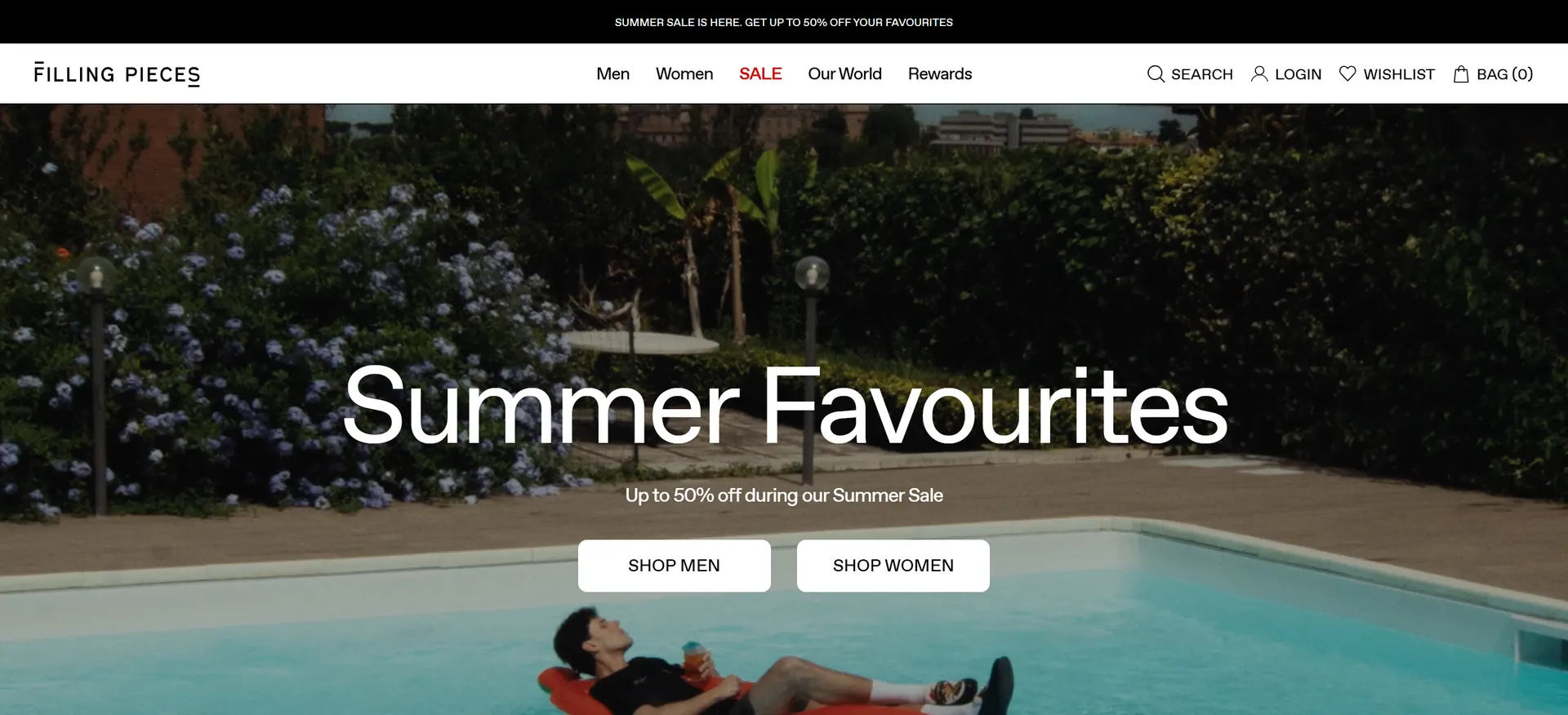
The store opens like a campaign rather than a shop front: a full-bleed seasonal image, a single confident headline, and two ways in — Shop Men and Shop Women. Navigation stays intentionally spare, letting the imagery lead and the product breathe.
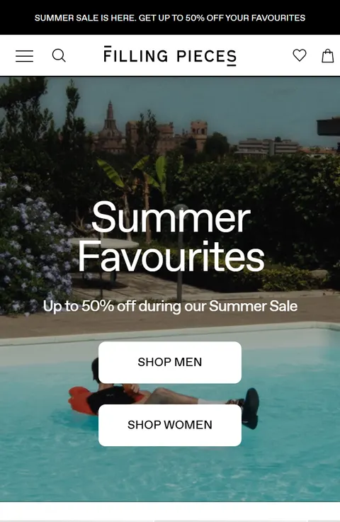
That editorial restraint carries down the page and across breakpoints. The mobile experience keeps the same large-format, image-first character rather than collapsing into a stripped-back list, so the brand feels as considered on a phone as it does on a desktop.
04
The Impact
Filling Pieces came away with a storefront that looks and moves like the brand it represents.
-
A lookbook that sells. Editorial layout and large-format imagery make every collection feel like a campaign, elevating the perception of the brand at the point of purchase.
-
Fast where it matters. Designed mobile-first and built for performance, the store keeps its immersive feel without sacrificing speed.
-
Room to keep dropping. A clean, image-led Shopify foundation lets the team push new collections and collaborations without reinventing the experience each time.

Collaboration
Got a project?
Let's talk.
We're a team of creatives who are excited about unique ideas and help companies to create amazing identity by crafting top-notch UI/UX.